

Designing Matteo’s Homepage with Clarity, Purpose, and Intent
A conceptual restaurant website design and homepage redesign exploring how Matteo’s - a casual Italian restaurant - could translate its warm, neighborhood dining experience into a modern, user-friendly website.
This redesign focuses on UX design, conversion-focused layout, and clear messaging to improve engagement and online visibility.
A Fresh Start for Matteo’s Online Presence
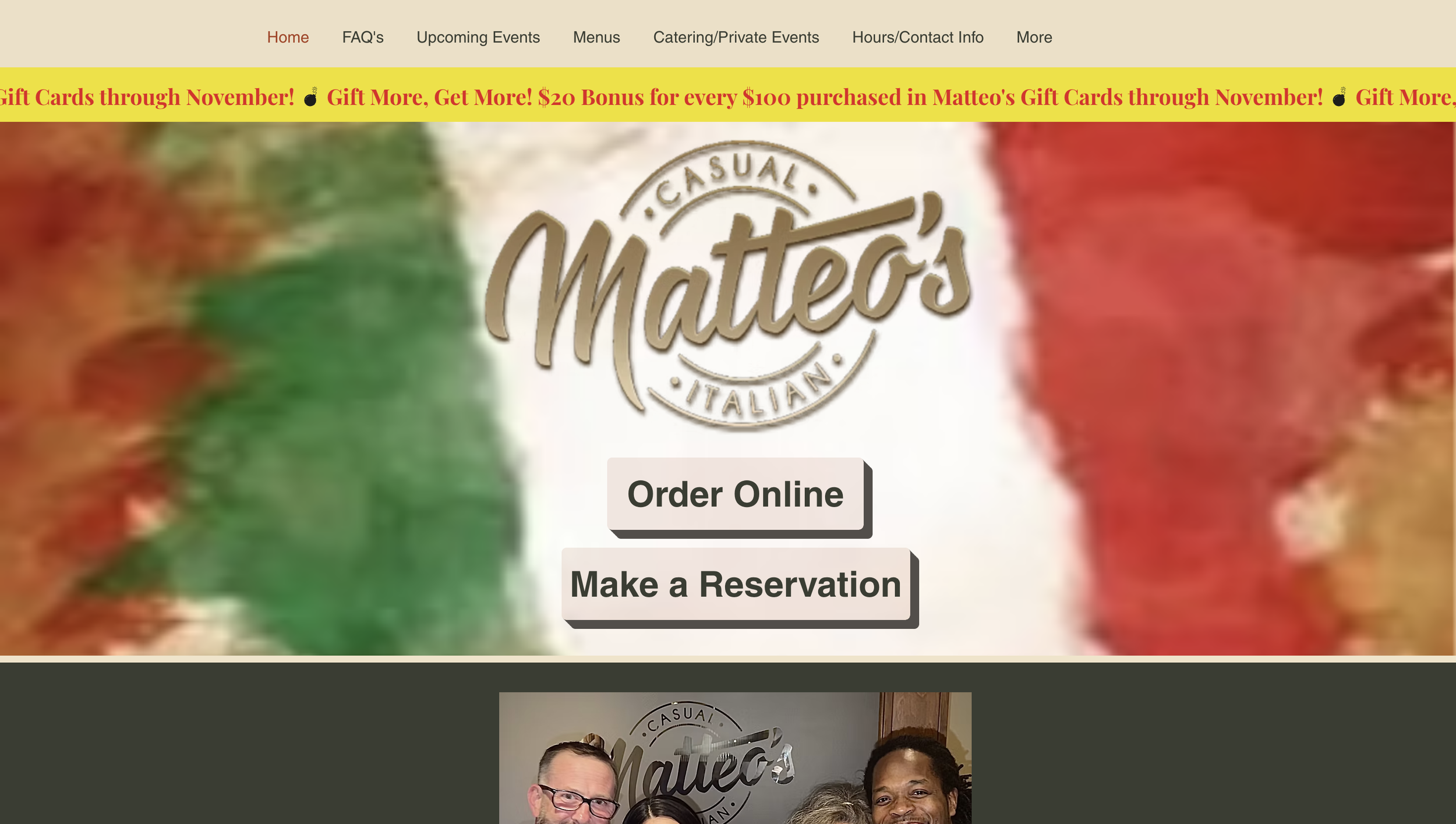
Matteo’s original homepage felt outdated, dense, and difficult to navigate - making it challenging for users to quickly understand the restaurant brand or take action (view menu, make a reservation, or explore the dining experience).
This restaurant website redesign concept focuses on improving clarity, usability, and visual hierarchy, creating a modern homepage experience that better reflects Matteo’s welcoming Italian identity while supporting stronger user engagement and conversions.
Every design decision was intentional - built to support a clean restaurant web design system with clear navigation, strong calls-to-action, and a more inviting digital presence.
Before the Redesign
The original homepage attempted to communicate too much at once. With inconsistent layout structure, competing visuals, and unclear calls to action, the experience felt overwhelming and made it difficult for visitors to know where to focus or how to interact with the site.
From a UX/UI and restaurant website design perspective, this created friction in the user journey and reduced clarity around key actions like viewing the menu or learning more about the restaurant.
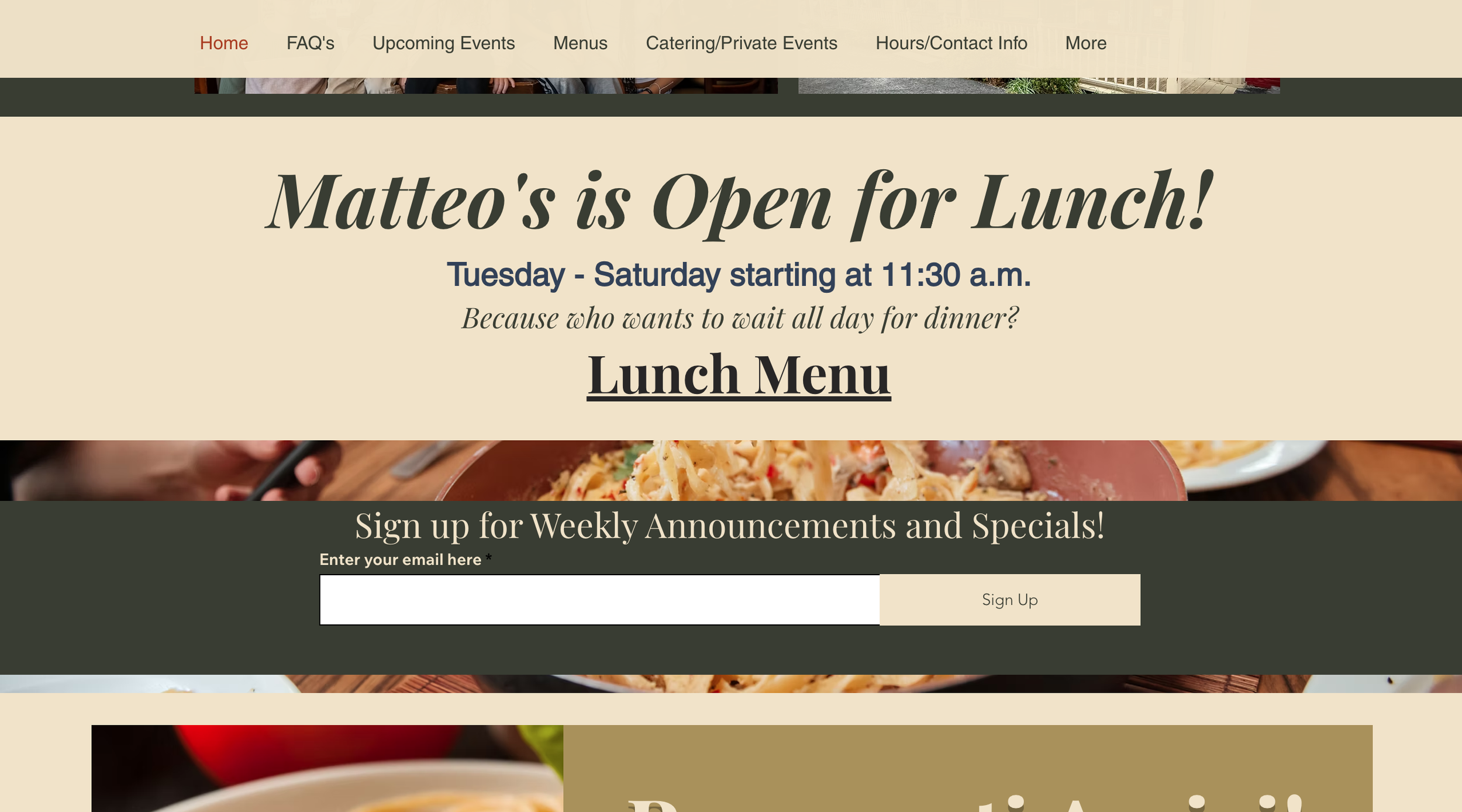
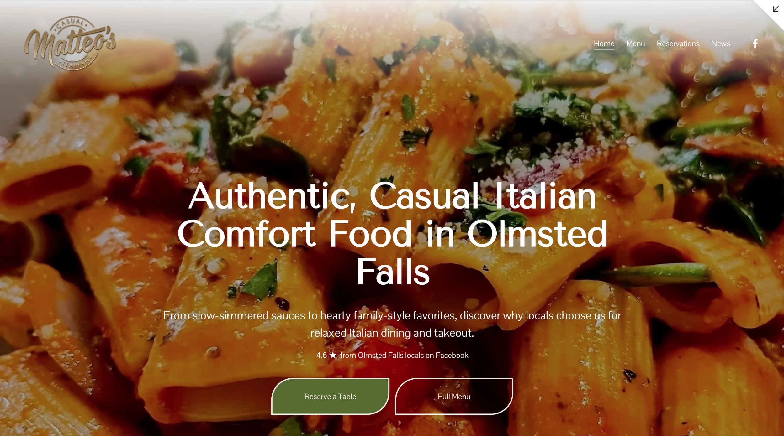
A Clearer, More Focused Direction
This homepage redesign concept for Matteo’s Italian restaurant introduces a simplified layout with intentional spacing, improved visual hierarchy, and structured content flow.
By applying conversion-focused web design principles, the new homepage becomes:
Easier to scan
Easier to navigate
More inviting for new and returning visitors
More effective at guiding users toward key actions
The result is a more modern restaurant website UX design that prioritizes clarity and usability.
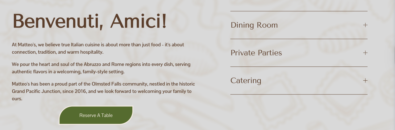
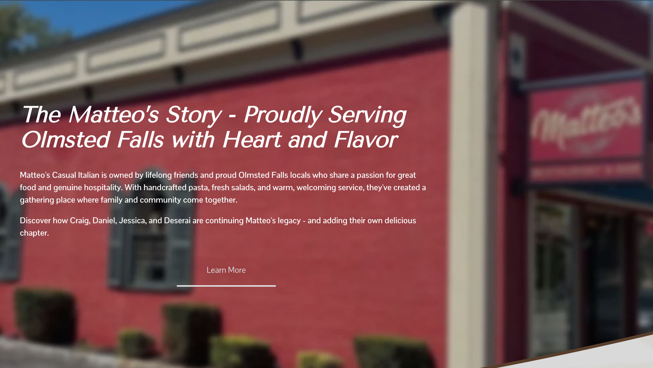
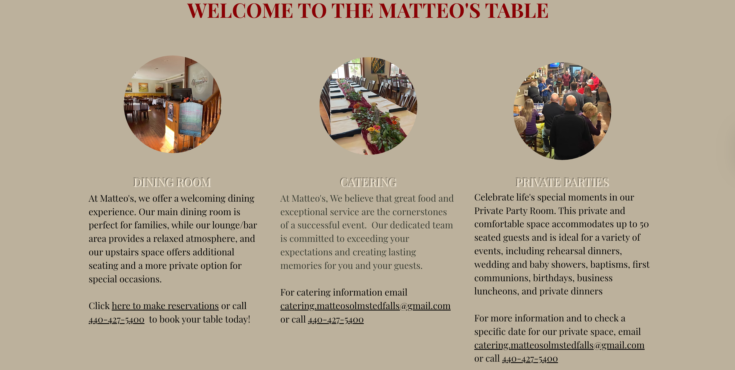
Designed Through the User’s Eyes
The redesigned homepage improves the overall restaurant user experience (UX) by introducing clear, intentional calls to action that guide visitors without overwhelming them.
Together, these updates create a more confident and engaging Italian restaurant website design that feels both professional and welcoming while staying true to Matteo’s casual dining identity.
Let’s Build Something Meaningful
Cuyahoga Falls Website Design & Branding Services
Let’s build a website that feels intentional, looks sharp, and works hard for your business.
A conversion-focused website design that helps your brand stand out, connect with customers, and grow online.